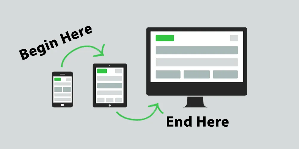
Mobile-first design puts mobile devices at the forefront. It starts with designing a website for mobile screens and then scales it up to larger ones like tablets or desktops. But why has this approach gained so much popularity?
First of all, consider how people access the internet these days. A large chunk of web traffic comes from mobile devices. In emerging markets, mobile often serves as the primary device for internet access. So, not giving importance to mobile design can be a big mistake. Moreover, Google’s algorithms now favor mobile-friendly sites. Therefore, mobile-first design is not only crucial for user experience but also for SEO.
Let’s dig into the fundamental aspects.
Limited space can be the first thing you notice when designing for mobile. Yet, this constraint can serve as an opportunity. You have to decide what’s most crucial and present that first. In doing so, you naturally prioritize the most important elements of your design.
Next, let’s talk about the importance of keeping things simple. Limited space means no room for clutter. Users should understand quickly what they’re looking at and how to interact with it. Clean interfaces, straightforward navigation, and unmistakable CTAs (Call to Actions) help a lot in this regard.

Last but not least, making your design responsive should be a priority. When you start with mobile, you’ll find it easier to scale up the design to larger screens. The layout will adjust itself based on the device’s screen size, providing an optimal user experience for everyone.
Let’s dive into some essential tools and techniques.
Firstly, CSS media queries enable you to apply different styles based on various conditions like screen size. It’s crucial for responsive design.
In addition, flexible grids are your friend. They help you make a layout that adjusts to different screen sizes. This way, you ensure a responsive design that looks good on any device.
Lastly, don’t forget about images, videos, and other media elements. These should also adjust depending on the device’s screen size. Use CSS’s max-width property or opt for SVGs for scalable vector graphics.
Yes, mobile-first design has significant implications for SEO.

First off, Google has a thing for fast websites. Mobile connections often run slower than desktop ones, so you need to optimize for speed. Compress your images and minify your CSS to make the cut.
Better mobile experience leads to increased user time on your site. Consequently, you’ll see an improvement in your SEO rankings. It’s as simple as that.
Moreover, Google primarily uses the mobile version of a site for ranking and indexing. A poorly designed mobile site or one lacking content can damage your rankings.
Even experienced designers make mistakes. Here’s what to avoid.
Mobile users often interact through touch. Ignoring touch gestures like swiping or pinching can create a frustrating user experience. Make sure you integrate these features into your design.
Overly complex menus or too many options can confuse users. So, make sure to simplify the navigation as much as possible.
Finally, testing is paramount. Different mobile devices have various screen sizes and capabilities. Make sure to test your design on a range of devices to ensure optimal responsiveness and user experience.
To sum it up, mobile-first design isn’t a trend; it’s a necessity. The increasing number of mobile users makes it imperative to prioritize mobile design. Plus, a well-designed mobile site is good for business and helps improve your SEO rankings. Start small, keep it simple, and scale up. That’s the way to succeed in the mobile-first world.