The Future of Parallax Scrolling in Web Design
Craig Valadez October 4th, 2023

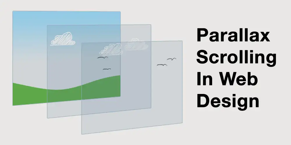
In the expansive universe of “The Future of Parallax Scrolling in Web Design”, few techniques evoke as much depth and immersion as parallax scrolling. As users weave their way through a website, the background and foreground elements move at contrasting speeds, crafting an illusion reminiscent of 3D. As 2023 unfolds, it’s pertinent to discern the trajectory of parallax scrolling and its enduring influence on modern web design.
Understanding Parallax Scrolling
Parallax scrolling is, at its heart, a technique where the background of a webpage moves slower than the foreground when a user scrolls. This disparity in movement pace endows websites with depth and dynamism, setting the stage for a more engaging user experience.
Examples:
- Storytelling Websites: Consider a site documenting the history of aviation. As users scroll, the background could depict clouds drifting slowly, while the foreground presents faster-moving vintage planes, transitioning to modern jets, encapsulating the journey of flight.
- Product Showcases: Imagine a shoe brand unveiling its latest collection. As visitors scroll, the backdrop could subtly showcase varying terrains, from mountains to urban streets, while the shoes in the foreground traverse these landscapes, highlighting their versatility.
Parallax Scrolling in 2023: Where Are We Headed?:
- Mobile-First Design: With a burgeoning mobile user base, designers are now optimizing parallax effects for mobile experiences. Expect more fluid animations that don’t drain battery life or reduce performance.
- Subtlety over Showmanship: Over the years, designers have realized that less is often more. Instead of aggressive parallax effects that can disorient users, 2023 is seeing a trend toward understated, purpose-driven parallax designs that enhance without overwhelming.
- Integration with AR and VR: With Augmented Reality and Virtual Reality technologies becoming more mainstream, parallax scrolling is set to play a pivotal role in bridging traditional web experiences with immersive 3D environments.
Example: A real estate company could create a VR tour of a property. As users scroll on the website, the background could present different rooms, moving languidly. In contrast, the foreground offers interactive elements – like furniture or decor options – that users can toggle, offering a personalized, immersive tour.
Benefits of Parallax Scrolling:
- Engagement Boost: The illusion of depth and movement can captivate users, making them more likely to interact longer with a website.
- Storytelling Amplified: Parallax offers a unique narrative tool, enabling brands to unfold their stories in a more interactive and memorable manner.
- Differential Focus: By having elements move at different speeds, designers can guide users’ focus to critical sections or calls to action more effectively.
Caveats and Considerations:
While The Future of Parallax Scrolling in Web Design offers numerous benefits, it’s not devoid of challenges. Excessive use can lead to motion sickness in some users. Furthermore, it can sometimes affect website performance and SEO if not implemented correctly.
Conclusion: The landscape of web design is continually evolving, and parallax scrolling, with its unique blend of depth and motion, remains a significant player. As we journey through 2023, the technique promises to be more refined, purposeful, and integrated into immersive digital experiences. Yet, as with all tools, the key lies in its judicious use, ensuring it adds value to the user experience rather than detracting from it.
