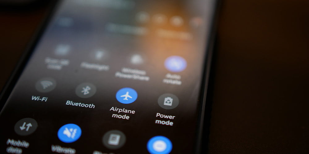
Dark mode, the savior of night owls, vampire enthusiasts, and people who simply prefer a sleeker screen aesthetic, has taken the digital world by storm. But what happens when designers embark on the treacherous journey of crafting interfaces fit for the shadows? Brace yourselves, fellow designers, for we’re about to dive into the inky abyss of designing for dark mode!
Designers, much like Jedi knights, have been engaged in a never-ending battle between the forces of dark and light. Dark mode proponents praise its battery-saving qualities and soothing aesthetic, while light mode aficionados argue that it’s easier on the eyes and more reminiscent of a sunlit day. It’s a clash of ideologies that can rival the Star Wars saga, and just like the Force, there’s no definitive answer.
Tip: When caught in this cosmic showdown, compromise is key. Create a toggle switch that lets users choose their destiny – dark or light. May accessibility be with you!
Ah, the quest for the perfect shade of darkness – it’s like trying to find the ideal spooky costume for Halloween. Designers need to strike a balance between a dark mode that doesn’t blind users in a dimly lit room and one that doesn’t have them squinting like pirates searching for buried treasure in a pitch-black cave.
Pro Tip: Test your dark mode on actual humans, not just your trusty code-monkey friend. After all, we don’t want users mistaking your app for a cryptic puzzle.
In a dark-themed interface, maintaining contrast is crucial. Icons, text, and images need to pop like a glow-in-the-dark unicorn at a rave. But it’s all too easy to go overboard, turning your app into a psychedelic light show.
Designer’s Nightmare: When users open your dark mode app, and their eyes feel like they just got back from an EDM festival. Use contrasting colors wisely; otherwise, you’ll have people reaching for their sunglasses.
Auto-dark mode, the feature that’s supposed to make your users’ lives easier, can also turn them into digital insomniacs. Imagine you’re browsing a harmless cooking website at 2 AM, and suddenly, BAM! Your screen goes dark, startling you awake like a caffeinated raccoon in a trash can.
Sage Advice: Always include an option to disable auto-dark mode. Not everyone wants their screens to mimic the enigmatic habits of a nocturnal hedgehog.
Designing for dark mode isn’t just about colors and contrast; it’s also about those delightful little details. Easter eggs that appear only in dark mode can be a treat, but they can also lead to user confusion.
Horror Story: Imagine a user who stumbles upon a hidden message in your app’s dark mode, reading, “Are you afraid of the dark?” Sure, it’s fun, but it might also trigger an existential crisis.
In the world of design, the allure of dark mode is undeniable, like a dark chocolate truffle – decadent and mysterious. But just as you wouldn’t devour a whole box of truffles in one sitting (unless you’re a certified chocoholic), you shouldn’t plunge into dark mode design without careful consideration.
Balancing aesthetics, usability, and the potential for sleepless nights, designers must tread the fine line between shadow and light. So, the next time you embark on the dark mode design journey, remember to keep it spooky but not too spooky, and may the pixels be ever in your favor!