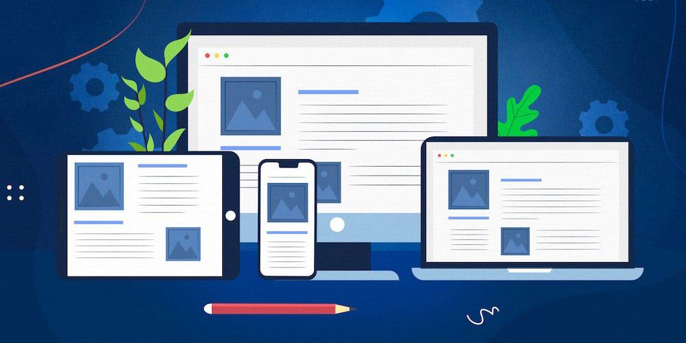
In a world where websites can’t strike a downward-facing dog pose or master the art of meditation, they rely on something else to stay flexible and adaptable—responsive web design. Just like that friend who can touch their toes without breaking a sweat, responsive design ensures that websites can gracefully adapt to any device or screen size. In this article, we’ll explore the importance of responsive web design and why it’s a must-have for any website that wants to stay relevant in the digital age.
Let’s face it; our beloved smartphones have become an extension of ourselves. They’re like the Swiss Army knives of the 21st century, capable of doing everything from ordering food to tracking our steps. With a significant chunk of internet traffic coming from mobile devices, websites need to be as mobile-friendly as a pocket-sized umbrella during a rainstorm.
Responsive design ensures that your website looks just as stunning on a smartphone as it does on a desktop. No more endless pinching, zooming, and squinting to read tiny text. A responsive website is like a warm hug for your users, welcoming them with open arms, no matter what device they’re using.
Google is like the internet’s overlord, and its algorithms dictate who’s in and who’s out in the digital realm. In 2015, Google made it clear that mobile-friendliness was a ranking factor. So, if you want your website to rise through the ranks of search engine results pages (SERPs), you’d better cozy up to responsive design. Think of it as impressing the boss to get that promotion, except in this case, the promotion is a higher search ranking.
Imagine this: you stumble upon a website that doesn’t care about responsive design. You zoom in and out like a deranged detective trying to decipher tiny clues on your smartphone screen. You finally give up, cursing the website designer’s name under your breath.
Don’t be that website designer! Responsive design is all about providing a seamless and enjoyable user experience. It’s like being the host of a party who ensures everyone has a comfortable seat and a drink in hand. Your users will thank you by sticking around longer and coming back for more.
The digital world is like a rollercoaster that never stops. New devices and screen sizes emerge faster than you can say “SEO.” With responsive design, you future-proof your website. It’s like giving your website a timeless wardrobe that looks great no matter the decade. Whether it’s the latest smartphone or a futuristic holographic display, your website will be ready to shine.
High bounce rates are like the internet’s version of a one-night stand. Visitors come, they see a non-responsive mess, and they bounce—never to return. Responsive design keeps bounce rates in check. Users stay longer, explore more pages, and engage with your content. It’s like turning a one-night stand into a long-term relationship (in the digital sense, of course).
Responsive design is not an optional extra; it’s the foundation of a modern website. It’s like having wheels on a car; you can’t get far without them. With more people accessing the web on a variety of devices, not having responsive design is like a chef without a knife—it just doesn’t cut it.
So, there you have it—responsive design is the unsung hero of the web. It ensures your website looks fantastic, keeps Google happy, delights users, and prepares you for the ever-changing digital landscape. So, if your website is still stuck in the past, it’s time to bring it into the future with a little yoga-inspired flexibility and a lot of responsive design magic. Namaste, webmasters!