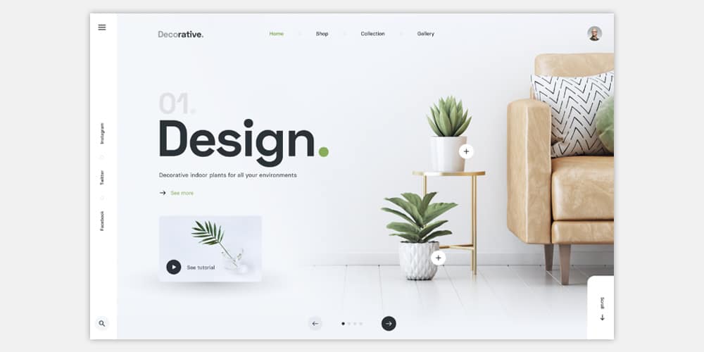
Ah, the internet – a wondrous land of endless possibilities, cat videos, and websites that look like they were designed by a hyperactive toddler with access to every color in the Crayola box. But fear not, dear netizens, for there is a design trend emerging from the chaos like a superhero in a sea of spandex-clad sidekicks: Minimal Website Design. So, grab your monocle, don your beret, and let’s dive into the world of pixelated Zen.
Remember the days when websites were like a Las Vegas buffet – all-you-can-eat sensory overload? Flashing banners, dancing GIFs, and pop-up ads that made you question your life choices? Well, minimal website design is here to rescue your sanity.
Minimalism isn’t just about removing stuff; it’s about focusing on what truly matters. In website design, that means stripping away the unnecessary fluff and focusing on the core message or functionality. Think of it as de-cluttering your digital space, like Marie Kondo for your homepage.
Ever had a website load slower than a tortoise with a backpack full of anvils? Yeah, us too. But minimalism is like a digital espresso shot for your site’s load time. With fewer elements to load, your site becomes the Usain Bolt of the internet, zooming past the competition in the blink of an eye. Your users will thank you with fewer impatient sighs.
In the age of smartphones, your website needs to be as mobile-friendly as a pair of stretchy pants at an all-you-can-eat buffet. Minimalist designs adapt beautifully to different screen sizes, ensuring that your website looks just as fabulous on Aunt Ethel’s ancient flip phone as it does on the latest iPhone.
Some may say minimalism is bland, like a rice cake at a birthday party. But it’s not about being bland; it’s about letting your content shine like a diamond in the rough. Minimal designs make your text, images, and products pop, drawing the eye to what truly matters. It’s like putting your website on a digital catwalk.
Have you ever visited a website and felt like you needed a sherpa to navigate through the clutter? Minimalist designs are like a GPS for your visitors. They guide users seamlessly through your site, making it easy to find what they came for without the headache-inducing maze.
Want people to actually buy your widgets, subscribe to your newsletter, or engage with your content? Minimalist design helps to reduce distractions and makes it clear what action you want your visitors to take. It’s like leading a horse to water and giving it a neon sign that says, “Drink Here!”
So there you have it, folks, the magic of minimal website design. It’s like a digital Marie Kondo for your online presence, tidying up the clutter, and bringing the spotlight to what matters most. Whether you’re selling widgets, sharing cat memes, or just trying to get your message across, minimalism is your ticket to a sleek, speedy, and successful website. So, embrace the less-is-more philosophy, and let your website shine brighter than a neon sign at a buffet for one.